Building a simple Launchy clone in WPF (Part 1/3: Blend)
As I mentioned in my previous post, I’m quite a fan of Launchy. For fun, I set out to create a simple clone of Launchy in C#/.NET 3.0. In this article, I’ll show what it takes to create a minimal but functional Launchy clone in about 2 hours. After working through this lab, it wouldn’t be too difficult to make the resulting program as functional as Launchy. But that’s outside of what I’m trying to accomplish here, so I’ll leave that to the tinkerers. 🙂
You will need several tools to build this application according to the tutorial. I will also assume you are familiar with the basic concepts of using them. Among the tools are:
- Microsoft Visual Studio 2005
- Microsoft Expression Blend Release Candidate 1
For more information about this software and others needed to get started developing WPF applications today, visit http://www.netfx3.com/.
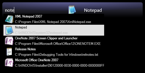
If you just want to see the result in action, you can download the whole 18.6kb archive here. The file is compressed with 7-zip, one of the greatest FOSS projects of all time IMO. 🙂 Remember this program runs without a window by design. To use it after you run it, press WinKey+Space. To exit, press WinKey+Space, then right click the dialog. Here is a screenshot:
Step 1. Creating the project
In Visual Studio, create a new WPF Windows Application project and solution. This sets up a ready-to-run (and do nothing) framework WPF application. On the plus side, this is one of the biggest time savers in getting started on our clone! To help you see immediate results from your work, whenever you see the  symbol, I encourage you to save your work and run the program to check out your latest changes. 🙂

This is a good place to run your program and test out the changes.
Step 2. Use Blend to rapidly create the basic window structure
Open the solution file you just created in Blend. Right off the bat we see Blend has opened the default Window1 window. For the sake of simplicity, we’ll go ahead and work with this window for our clone.
Part 2.1. Get rid of the standard window borders
Since we’re using a completely custom window style for this application, we need to start with a “clean slate.”
- In the Objects and Timeline task pane (on the left side of Blend by default), select
[Window]. The rest of this part works in the Properties pane (on the right side by default). - Set the
WindowStyletoNone. Really cool tip: Type wind in the Search box at the top of the Properties pane. There’s theWindowStyleoption. This gets rid of the title bar. - Set the
ResizeModetoNoResize. This gets rid of the remaining thin border used for resizing.
This is a good place to run your program and test out the changes.
Part 2.2. Create our basic styled window
This short part sets up the primary visual style of our clone. At the end of this part, there is no mistaking where our clone is headed.
2.2.1. Create a rectangle for our background
- In the Objects and Timeline pane, select the
[Grid]item by double clicking it. The resulting yellow border indicates that the objects we’re about to create will be created as children of the[Grid]. - Select the Rectangle shape from the tool bar on the far left side of Blend (see picture). After the Rectangle tool is selected, proceed to double click the rectangle tool icon (yes the one you just selected). This inserts a default rectangle into the grid.

- In the Properties pane for the rectangle, set the
WidthandHeighttoAuto, and set theHorizontalAlignmentandVerticalAlignmenttoStretch. Then round the edges by setting theRadiusXandRadiusYto6. - In the Properties pane’s Brushes section, remove the Rectangle’s outline by clicking
Stroke, then clickingNo Brushfrom the options just below. - Similarly, set the
FilltoGradient brush. Before setting the colors, we’ll make the gradient vertical. - Select the Brush Transform tool by pressing B or by clicking it in the toolbar:
 Rotate the gradient orientation by placing the mouse cursor just off the edge of the gradient arrow’s start (note the custom cursor appearance in the following picture), then click and drag to rotate until it points up. Before releasing the mouse, press the Shift key to make the rotation snap to exactly vertical.

- Again the Properties pane, adjust the gradient by changing the white end to a dark bluish-gray (about
R70 G70 B90). - Now we’ll add the drop shadow. In the Appearance section of the Properties pane, click the downward arrow at the bottom to expand the advanced appearance options. Click the down arrow for
BitmapEffectand selectDrop Shadow. Set theShadowDepthto6andOpacityto80%. - If you click
[Window]again at this point, you should have a window that looks about like this:
This is a good place to run your program and test out the changes.
2.2.2. Resize the window
- In the Objects and Timeline pane, click to select the
[Window] - Set the
Heightproperty to65and theWidthto500
This is a good place to run your program and test out the changes.
2.2.3. Add a “3D” highlight effect
- In the Objects and Make sure [Grid] is still the target container (in yellow). Right click on Rectangle and copy it, then right click on [Grid] and paste it.
- Click to select Rectangle_Copy and press Ctrl+Shift+O to convert the rectangle to a Path. Set both the Fill and Stroke of the path to No Brush.
- In the Objects and Timeline pane, select the Border tool just like the you did for the rectangle and double click to insert a default Border object.
- We want the border to lie directly over the rectangle from the previous part, so click to select [Border] and head over to the Properties pane.
- First, bind the Width to the rectangle to force it to match. Do this by clicking the “dot” next to the Width property text box and selecting Data Binding… Select the Element Property tab, then expand the tree in the left panel until you see [System.Windows.Shapes.Rectangle] in the left (Scene elements) pane. Select this item, then select Width from the right (Properties) pane. Click Finish to complete the binding.
- Repeat step 5 to bind the Height, HorizontalAlignment, VerticalAlignment, and Margin properties of the border to those of the rectangle.
- Bind the Clip property of the border to the Data property of the Rectangle_Copy (the Path).
- In the Objects and Timeline pane, double click the [Border] to make it the target for inserting a new object (now it will get the yellow outline).
- Insert a default Ellipse just like you inserted a default rectangle before, then select it so you can work with its properties.
- First, set both the HorizontalAlignment and VerticalAlignment to Center. Set the Height to 60 and the Width to 500 like our window is. Then adjust the Width to make it a bit wider than the background (mine turned out well at 660). Notice that the Clip property of the border keeps the visible part of the Ellipse from going outside the bounds of our rectangle.
- Now this is a cool feature. We will use a “negative margin” to position the ellipse a bit off the top of our window. Adjust the top margin until the bottom of the ellipse crosses through about the center of the background rectangle. (you can click the numerical text box for the top margin in the properties pane and drag up/down to adjust with a live preview). Here is an example of the result when the margin is
-54.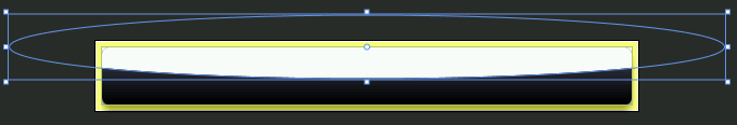
- In the Brushes section of the Properties pane, set the
StroketoNo brushand theFilltoGradient brush. - Change the fill to use a
Radial gradient(it’s a little button below the color selector). - Set the color at the center of the gradient (left side of the gradient adjuster) to
R139 G139 B255(light blueish purple). Set the color at the edges toR32 G32 B70(a nice dark blue). - Set the
OpacityMasktoSolid Color Brush, make it black, and set the alpha (A) channel to35%.
At this point, you should be able to run your program and see a clean custom window for our clone:

2.3. Text and an icon (err… icon placeholder)
- Add a default TextBox to the
[Grid]. At the top of the Properties pane for the image, name ittxtSearchBox. - Set the
BorderBrushtoNo brush, and set theForegroundto solid white. Set theBackgroundto solid black with alpha 0 (R0 G0 B0 A0) to force a white cursor to appear while typing. - Set the
HorizontalAlignmenttoLeftand theVerticalAlignmenttoCenter. - Set the left margin to
10. - Set the
Widthto200and theHeighttoAuto. - Choose a font and size you like from the Text section. I used Segoe UI size 16.
- Add a default Image to the
[Grid]and name itactiveItemIcon. - Set its
HorizontalAlignmentandVerticalAlignmenttoCenter, theWidthandHeightto32. Note: the image will appear off-center until we give it an image later. - Now add a default TextBlock to the
[Grid]and name itactiveItemTitle. - Set the
FontFamilyandFontSizeto the same ones you used for the txtSearchBox TextBox. - Set the
TextWrappingtoNoWrap. - Set the
HorizontalAlignmenttoRightand theVerticalAlignmenttoCenter. - Set the right margin to 10.
- Set the
Widthto200and theHeighttoAuto.
This is a good place to run your program and test out the changes.
2.4. A pop-up list of search results
2.4.1. The Popup and ListBox
In this segment, will create a popup window that we can use to display a list of available programs to the user.
- Add a default Popup to the
[Grid]. - Set the
[Popup]to open under the text box by binding itsPlacementTargetproperty to the TextBox itself (in the binding window, select thetxtSearchBoxscene element and the topTextBoxproperty) and checking the box for theIsOpenproperty. - Double click the child
[Grid]inside the[Popup]to select it for placing items. - Insert a default
ListBox.
2.4.2. Creating a simple SearchResult to represent our list items
Well I said this is the Blend part, but we’re going to take a short detour to Visual Studio that will have a huge impact on the ease and understanding of next steps. Our pop-up is going to be used to display a list of search results. At this point, we’ll create a skeleton class to represent a single search result.
First, we need to add a .NET reference to our project. In Visual Studio, from the Project menu select Add Reference… Then under the .NET tab, find “System.Drawing” and click OK.
Now add a new class to the project called SearchResult, and fill it in as follows (adds a few properties and 2 constructors):
1 2 3 4 5 6 7 8 9 10 11 12 13 14 15 16 17 18 19 20 21 22 23 24 25 26 27 28 29 30 31 32 33 34 35 36 37 38 39 40 41 42 43 44 45 46 47 48 49 | public class SearchResult { private string name; private string command; private string shortcut; private System.Windows.Media.ImageSource icon; /// <summary>Gets the display nome of the search result</summary> public string Name { get { return name; } } /// <summary>Gets the search result's actual command</summary> public string Command { get { return command; } } /// <summary>Gets the filename of the shortcut on disk this result was read from</summary> public string Shortcut { get { return shortcut; } } /// <summary>Gets a WPF TmageSource for the icon to display for the search result</summary> public System.Windows.Media.ImageSource Icon { get { if ( icon == null && System.IO.File.Exists( Command ) ) { using ( System.Drawing.Icon sysicon = System.Drawing.Icon.ExtractAssociatedIcon( Command ) ) { // This new call in WPF finally allows us to read/display 32bit Windows file icons! icon = System.Windows.Interop.Imaging.CreateBitmapSourceFromHIcon( sysicon.Handle, System.Windows.Int32Rect.Empty, System.Windows.Media.Imaging.BitmapSizeOptions.FromEmptyOptions( ) ); } } return icon; } } public SearchResult( string name, string command, string shortcut ) { this.name = name; this.command = command; this.shortcut = shortcut; } public SearchResult( ) : this( "Calculator", System.Environment.GetFolderPath(Environment.SpecialFolder.System) + @"\calc.exe", "" ) { } } |
2.4.3. Use Blend to add SearchResults objects to the pop-up’s list box
Before switching back to working in Blend, make sure to build your solution. This allows Blend to find the class we just created.
- In the properties pane for the
[ListBox]inside the pop up, find theItems (Collection)property and click “…” - Click Add another item, select SearchResult from the list, and click OK. Repeat this until there are 4 SearchResult objects. Then click OK to close the Items dialog.
- Set the
[Grid]inside the pop up to have aWidthof350so we can actually see the results, and set itsHeighttoAuto. - Select the
[ListBox]again and change theHorizontalScrollBarVisibilityandVerticalScrollBarVisibilitytoHidden. - Set the background brush to solid black and the foreground brush to solid white.
- Hide the border by setting each of the
BorderThicknessvalues to0.
When you run your program at this point, the window should look similar to the following:

2.4.4. Creating a template to display meaningful search results
- Create a new ItemTemplate by right clicking
[ListBox]in the Objects and Timeline window, then selecting Edit Other Templates, Edit Generated Items (ItemTemplate), Create Empty… Set the resource name (key) to the more-meaningfulsearchResultTemplateand click OK. - Add a default Grid to the ItemTemplate, then select it as the target for new objects.
- Find the
ColumnDefinitions (Collection)property and click “…” - Click Add another item twice to add 2 columns. Then set the Width of each to
Autoand press OK. - In a similar fashion, add 2 auto-height rows to the
RowDefinitions (Collection). - Set the
WidthandHeighttoAuto. - Add a default Image to the Grid, then set its
WidthandHeightto32,HorizontalAlignmentandVerticalAlignmenttoCenter, andMarginon all sides to3. - Set the image to take up both rows in the first column by setting
RowandColumnto0,RowSpanto2, andColumnSpanto1. - Now add 2 default TextBlocks to the Grid. Name one of them nameText and the other commandText. Set the
HorizontalAlignmentof bothLeftand theVerticalAlignmenttoCenter - Set the nameText TextBlock’s
Rowto0,Columnto1, andRowSpanandColumnSpanto1. - Set the commandText TextBlock’s
Rowto1,Columnto1, andRowSpanandColumnSpanto1. - Bind the nameText
Textby selecting the Explicit Data Context tab in the Create Data Binding dialog, checking the “Use a custom path selection” box, and typingName, since that is the get property of the SearchResult object we want to show. Click Finish to apply the change. - Similarly, bind the commandText
Textto the custom pathCommand. - Now select the
[Image]and bind theSourceproperty to the custom pathIcon. - Change the Foreground of commandText to solid light gray (R200 G200 B200 works well).
- In the Objects and Timeline pane, click the Scope Up (
 ) button to return from editing the ItemTemplate.
This is a good place to run your program and test out the changes.
2.4.5. Make the main window display the selected item from the pop-up list
- Set the
SelectedIndexof the[ListBox]to2. - Bind the
DataContextof bothactiveItemTitleandactiveItemIconto theSelectedItemproperty of the[ListBox]. - Bind the
Textproperty ofactiveItemTitleto the custom pathName(explicit data context again). - Bind the
Sourceproperty ofactiveItemIconto the custom pathIcon.
This is a good place to run your program and test out the changes.
3. Conclusion
Well, that’s all for this part. In Part 2, I’ll show how to rapidly add the program logic using Visual Studio.
Really appreciate you posting this tutorial.
April 23rd, 2007 at 10:13 pm[…] Building a simple Launchy clone in WPF (Part 1/3: Blend) […]
August 28th, 2007 at 12:49 pmThanks for posting Sam 🙂
June 13th, 2008 at 5:57 amThanks Sam.
January 19th, 2009 at 4:13 amAny chance of posting the XAML?
November 26th, 2009 at 10:02 amThanks a lot.
My xaml output(if anyone wants to compare it or use as reference is a step did goes wrong). I edited a copy of the txtSearchBox template in order to remove the “onFocus” and “MouseHover” ugly blue border. http://pastebin.com/PHRvUT9Z
February 3rd, 2014 at 6:41 pm